Brand Guidelines
These guidelines are designed to make it easy for anyone, anywhere, to create work that looks, feels, and sounds like CreativeX.
Here, you’ll find guidance on everything that shapes how we show up in the world: our visual language, our tone of voice, and all of the tools we use to tell our story.
Contents
01 Brand Strategy
Our brand attributes define how we think, make, and communicate. By agreeing on the brand as a company, we become faster, we realize the bigger picture, and we maintain consistency across all teams.
Brand Words
Our boilerplate copy gives us a consistent way to talk about who we are and what we do. It’s reusable, recognizable language and helps unify our messaging across channels—whether we’re writing for a sales deck, an article, or updating the website.
Refractive
We turn the mundane into something magical. We focus more on the relationships and transformation than the data and information we provide.
Wonder
We seek understanding and think curiously, but are still principled and evidence-based. We investigate the “so what?”. We’re not insatiable or mired in indecision. We’re aware of trends but aren’t dictated by them.
Perceptive
We value being contemplative and observant and probe for deeper meaning. We ask questions first and balance learning with initiative.
Intentional
All our words have a purpose, and we strive to create moments of impact. We avoid decoration unless there’s a strong brand purpose.
02 Personality
This guide is here to define our voice and ensure every piece of content we create is thoughtful, consistent, and unmistakably ours.
Boilerplate Copy
Our boilerplate copy gives us a consistent way to talk about who we are and what we do. It’s reusable, recognizable language and helps unify our messaging across channels—whether we’re writing for a sales deck, an article, or updating the website.
1-sentence description
CreativeX is the only impartial system of control that unifies creative, content, and media into a single, living source of truth, enabling marketers to prove what works and scale it globally.
Short CTA’s
Start your creative excellence journeyTransform your creative decision-makingMake every creative decision count
Tagline
Achieve creative excellence at scale
Descriptor
Creative decisioning platform
Long description
CreativeX is the only impartial system of control that unifies creative, content, and media into a single, living source of truth, enabling marketers to prove what works and scale it globally. Used by brands like Heineken, Bayer, and Unilever, CreativeX integrates directly into production and media workflows, connecting creative decisions with business outcomes to make every ad work harder.
Even longer description/Press
CreativeX is the only impartial system of control that unifies creative, content, and media into a single, living source of truth, enabling marketers to prove what works and scale it globally. Used by brands like Heineken, Bayer, and Unilever, CreativeX integrates directly into production and media workflows, connecting creative decisions with business outcomes to make every ad work harder.
By analyzing patterns across millions of ads, CreativeX’s AI-powered platform delivers clarity marketers use to make creative decisions that keep performing over time. Clear benchmarks and actionable insights eliminate guesswork, helping marketers optimize content across channels, scale effective strategies, and get more value from investments.
Tone of Voice
Tone of voice is how we communicate. It’s the personality behind our words—represented through four principles that shape how our message is received and understood
Definitions
The four principles that make our tone of voice—and why they matter
Character Driven
The first rule of telling great stories is ‘make me care.’ We find opportunities to elevate data stories through character-driven narrative arcs. We leverage powerful emotional moments to invite partners to share the stage.Emphasized in: Social media, decks and presentations, email and newsletters
Measured Wit
People don’t read content; they read what interests them, and sometimes it’s our content. We use levity to balance the heaviness of business and bring humanity to our work.Emphasized in: Social media, marketing copy
Reassuringly Confident
How you say it matters. We proactively elevate and credit others. We leave space for them to speak. We edit out. We ask questions. We use value-led statements. We use data to be authoritative.Emphasized in: Decks and presentations, marketing copy
Precisely Evocative
People remember how you made them feel. We’re a data company that believes in the power of stories. We fuse facts and feelings.Emphasized in: Decks and presentations, email and newsletters
Quick Guide
A simplified, easy-reference guide to our tone of voice
Measured Wit
Do
Clever, approachable
Don’t
Sarcastic, too casual
Character Driven
Do
Relatable, human-centric, storytelling
Don’t
Faceless, overly formal
Precisely Evocative
Do
Emotionally resonant, driving a narrative, audience-aware
Don’t
Vague, fluffy, generic
Examples
Real-world before-and-after examples that show how to apply our voice principles
Measured Wit
Like This
When your brand’s values align with the communities you care about, your message resonates, and your reach grows. As Rory Sutherland puts it, "Good creative can actually create your customers."
Not This
By strategically mapping brand values to specific consumer groups, brands are empowered to amplify their reach, ensuring broader audience engagement through more authentic positioning and maximized CEP optimization for future growth.
How it Works
We swapped out jargon for a more human-centered message. Instead of focusing on technical terms, we make an emotional connection between brand values and community impact, keeping the content personal and relatable. The quote adds a character-driven touch, anchoring the message with an expert voice. This version shows that data is about real people, not just numbers.
Character-Driven
Like This
"We had so many agencies, so many partners, and no system," recalls Marion Villette, Bayer’s Global Procurement Marketing Category Lead. This disconnect meant 52% of core assets were never activated across markets. With Creative Lifecycle, Bayer increased activation from 48% to 80%, proving that efficiency drives value.
Not This
CreativeX’s analysis demonstrated that 52% of core assets created by brands were never activated across their markets. This means paid-for creative work was never given an opportunity to drive business value or exposed to the consumer.
How it Works
Stories are powerful. By bringing in a real voice and a real challenge, we turn data into something human. It’s no longer just a stat—it’s a relatable story with a clear outcome. This makes the message memorable and demonstrates that people are at the heart of everything we do.
Precisely Evocative
Like This
Research shows that accessibility and inclusivity drive performance. Ads with text captions boost the likelihood of full viewership by 120%, while diverse casting makes ads 58% more likely to stand out.
Not This
Research from the index: Ads with text captions improve the likelihood of watching the ad completely by 1.2X, brand differentiation improves by 2.3X and purchase intent 1.2X. Ads with simple on-screen text are 1.2X more likely to drive brand recall. Diverse casting choices positively impact ads’ differentiation - 58% more likely to be perceived as different from other ads.
How it Works
Instead of throwing a wall of stats at the reader, we tell a more compelling story by connecting performance with inclusivity and accessibility. The numbers are still there, but they’re part of the larger narrative of driving creative impact. This makes the message easier to digest and more evocative.
Reassuringly Confident
Like This
CreativeX analyzed nearly 900,000 ads from 2020-2021 and found that over half of media budgets went toward creatives that missed key elements for success. By tracking these elements across your content, CreativeX ensures every dollar drives better outcomes.
Not This
CreativeX analysis of almost 900,000 ads from 2020-2021 found that 55% of media spend was deployed on sub-optimal creatives. Meaning these ads did not adhere to key creative best practices and were therefore not fit-for-platform.
How it Works
We lead with authority, laying out the facts and immediately following up with the solution. This clear, no-frills approach helps build trust, ensuring that the reader knows the data is backed by a solid methodology, while focusing on the positive impact of taking action. We removed unnecessary qualifiers and made the solution front and center.
Style and Mechanics
Grammar, punctuation, and style standards to ensure our message is clear, consistent, and aligned with our brand’s voice
Fundamentals
A few simple rules to keep things clear, consistent, and easy to read
Simple
Make every word count—strip away the unnecessary to deliver your message with focus.
Clear
Ensure the message is easy to understand at a glance; avoid jargon and over-complication.
Accessible
Never assume prior knowledge of your audience. Anchor product terms in real-world impact. No acronyms or marketing jargon—speak clearly to everyone.
Value-led, story-driven
Lead with benefits and create a natural flow in your messaging. Every sentence should support a narrative arc that brings the value home and keeps the reader engaged.
Mechanics
Punctuation, grammar, and all the small details that keep our writing sharp
Regional consistency
We use American English spelling and units of measurement across all content.
Capitalization
For most content, use standard capitalization. Exceptions include H1 titles, which use title case, and labels or button text, which use small caps for distinction and hierarchy.
Headings and Subheadings
Headings and subheadings should offer clear structure, making the content easy to scan. Good headings = good engagement.
Punctuation
Precision matters. Use punctuation to guide the reader through the content—clear, well-placed commas, periods, and dashes help us communicate confidently without over-explaining.
Style
Guidelines on how we show up on the page—headlines, hierarchy, and formatting
Purpose-forward
Every sentence should move the reader forward—be purposeful and avoid filler. Make every word count toward delivering clear value.
Inclusive language
Be inclusive and thoughtful in how you address the audience. Avoid assuming gender or phrases that might alienate or exclude; always speak to the widest possible audience with care and consideration.
Active voice
We speak in the active voice to create direct, confident content.
Formality and flexibility
We lean into conversational language. Adapt the tone to fit the platform and audience, but always maintain the core attributes that define our voice.
Helpful Resources
Writer’s Tips
Advice to help fine-tune your writing
Start with the "why"
Before diving into product details, start by explaining why it matters to the reader. Ground the content in their needs and motivations before going into the specifics.
Show, don't tell
Whenever possible, let the product’s value speak through its real-world impact.
Know your audience
Tailor writing to meet the expectations and understanding of the audience. Keep their knowledge, interests, and needs in mind to ensure your content is relevant.
Read aloud
Reading content out loud can help ensure it sounds conversational and natural. If a sentence feels awkward to say, it’s probably awkward to read.
Cut the clutter
After drafting, go back and edit ruthlessly. Ask yourself, “Does this sentence serve a clear purpose?” If not, remove it or tighten it up. Brevity is clarity.
Helpful Resources
Punctuation, grammar, and all the small details that keep our writing sharp
George Orwell's Politics and the English Language
A timeless guide that emphasizes the power of clear, straightforward language to communicate effectively
Really Good Emails
A collection of well-executed email campaigns showcasing effective copy and design, perfect for finding inspiration for compelling and clear communication
Hemingway App
A useful writing tool that highlights overly complex sentences and passive voice
03 Color
Color influences how our brand is recognized and remembered. It’s what ties our work together across our product, campaigns, and moments of communication.
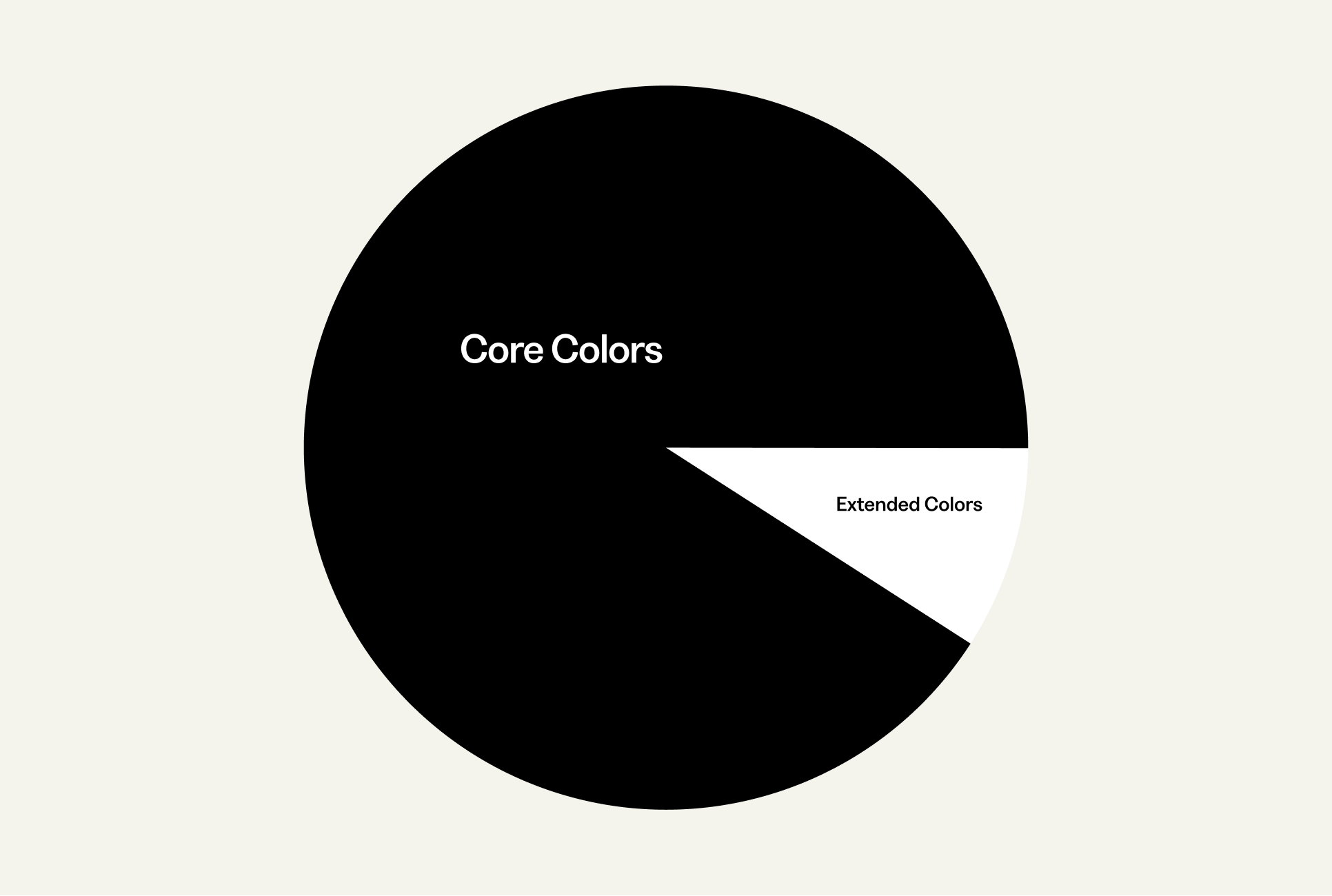
The core palette includes the colors that are used most often and across our most visible brand touchpoints. The extended palette builds on this, offering some flexibility for a wider range of applications.
Core Palette
Coral
Hex: #FF6275
Blue Tint
Hex: #F2A74E
Ocean
Hex: #003C4F
Denim
Hex: #031531
Taupe
Hex: #F4F3EC
Extended Palette
P200
Hex: #EAE6FF
P500
Hex: #8777D9
B200
Hex: #DEEBFF
B400
Hex: #4C9AFF
Rose
R100
Hex: #FFDADF
R200
Hex: #FF9DA9
R300
Hex: #FF6275
R400
Hex: #FF445A
R500
Hex: #E33347
R600
Hex: #C60E24
R700
Hex: #992936
R800
Hex: #701B25
Blue
B100
Hex: #F2F6FC
B200
Hex: #DEEBFF
B300
Hex: #B2D4FF
B400
Hex: #4C9AFF
B500
Hex: #2684FF
B600
Hex: #0065FF
B700
Hex: #073983
B800
Hex: #031531
Teal
T100
Hex: #D6F5FF
T200
Hex: #C2F1FF
T300
Hex: #85E2FF
T400
Hex: #47D4FF
T500
Hex: #0AC6FF
T600
Hex: #009CCC
T700
Hex: #006D8F
T800
Hex: #003C4F
Green
G100
Hex: #E2FFEE
G200
Hex: #ABF5D1
G300
Hex: #79F2C0
G400
Hex: #57D9A3
G500
Hex: #36B27E
Navy
Hex: #00875A
G700
Hex: #006644
G800
Hex: #004930
Orange
O100
Hex: #FCF1E5
O200
Hex: #FBD8AE
O300
Hex: #F8BF79
O400
Hex: #F2A74E
O500
Hex: #FF8B00
O600
Hex: #FF6600
O700
Hex: #EA5D00
O800
Hex: #C54F00
Purple
P100
Hex: #F9F8FF
P200
Hex: #EAE6FF
P300
Hex: #C0B6F2
P400
Hex: #998DD9
P500
Hex: #8777D9
P600
Hex: #6554C0
P700
Hex: #5243AA
P800
Hex: #403294
Sand
S100
Hex: #FAF9F5
S200
Hex: #F4F3EC
S300
Hex: #F5F0E3
S400
Hex: #F0E5CB
S500
Hex: #EEDCB2
S600
Hex: #BEB08E
S700
Hex: #5F5847
S800
Hex: #302C24
Greys
White
Hex: #FFFFFF
Grey 100
Hex: #FAFAFA
Grey 200
Hex: #F3F3F3
Grey 300
Hex: #E0E0E0
Grey 400
Hex: #BDBEBF
Grey 500
Hex: #939598
Grey 600
Hex: #767676
Grey 700
Hex: #605E5C
Grey 800
Hex: #414042
Black
Hex: #000000
Color Percentage Breakdown
04 Typography
Typography is one of the clearest reflections of our voice. It sets the tone before a single sentence is read and influences how our words are understood and remembered.

Typography is one of the clearest reflections of our voice. It sets the tone before a single sentence is read and influences how our words are understood and remembered.
Primary Typeface
Greed Standard
Secondary Typeface
Victor Serif
Power every creative decision with data
Headlines: Greed Medium + Victor Serif Regular Italic for emphasis
110% Leading
-1% Tracking
“The magic, and what I really like about CreativeX, is that it enables us to get data for so many things that never had this exposure.
Quotes: Victor Serif Regular
130% Leading
-1% Tracking
“This is what CreativeX really helped us with, the Creative Quality Score— we can look across the board and have 1 consistent conversation with the heads of the countries.”
Body: Greed Regular
130% Leading
-1% Tracking
SOUND OFF: TRUE
Labels: Greed Medium
130% Leading
10% Tracking
Fallback States
Primary Typeface
Inter
Secondary Typeface
PT Serif
05 Logo
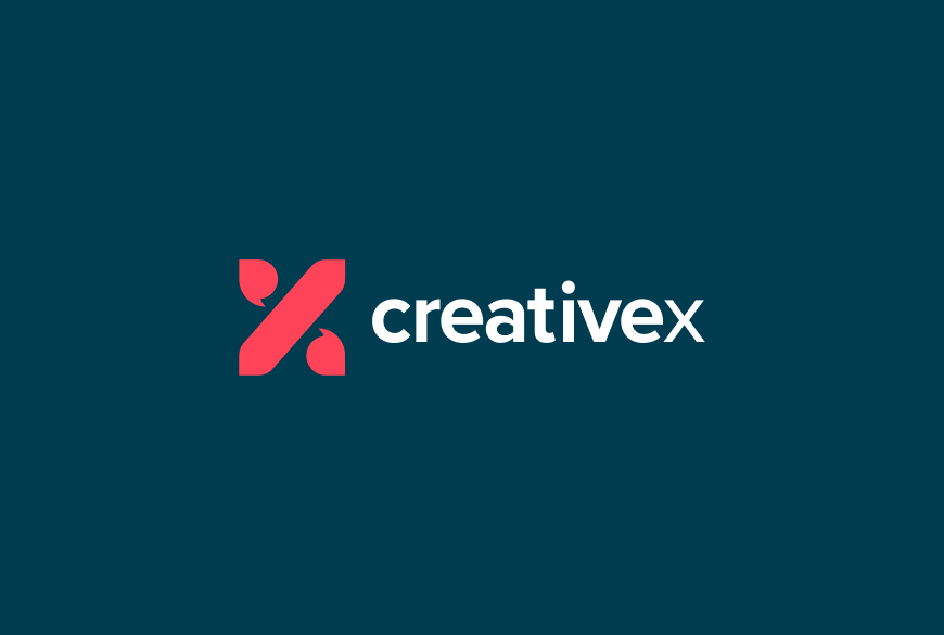
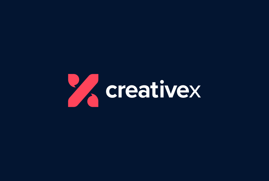
The CreativeX logo is composed of an X shape inspired by the % and a logotype set in Proxima Nova. It is primarily in the CreativeX rose color and dark grey.
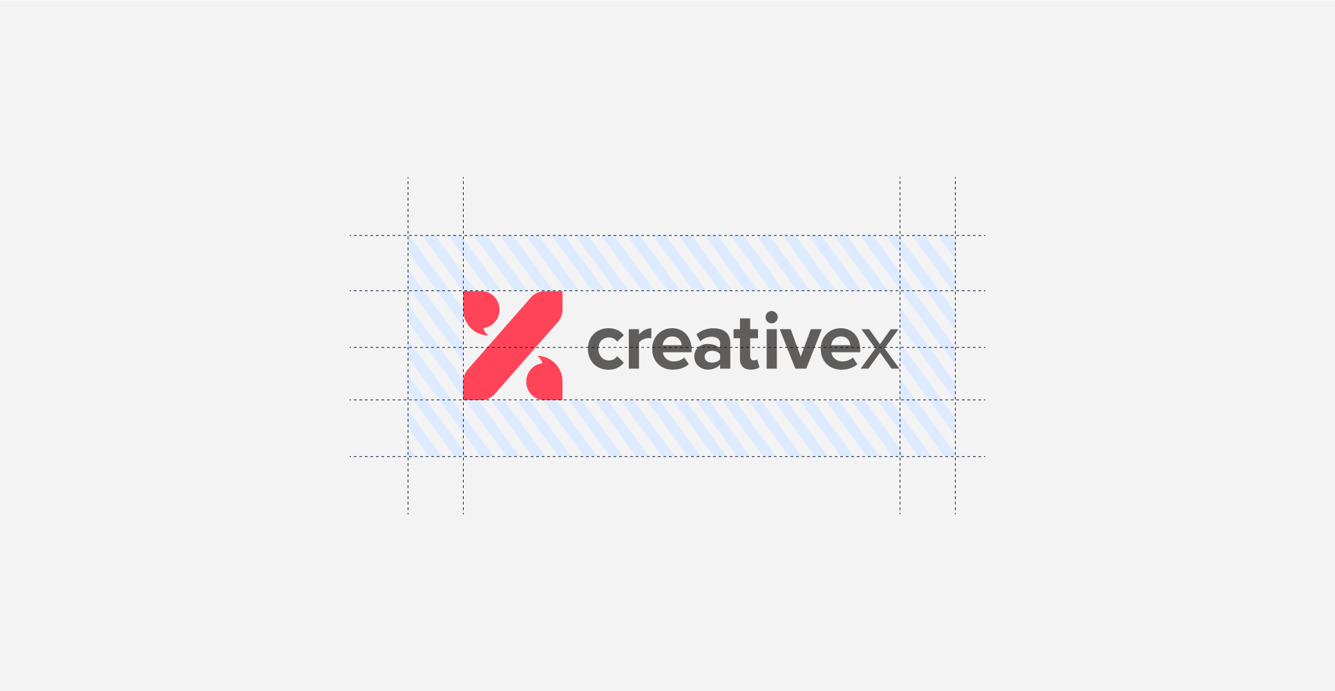
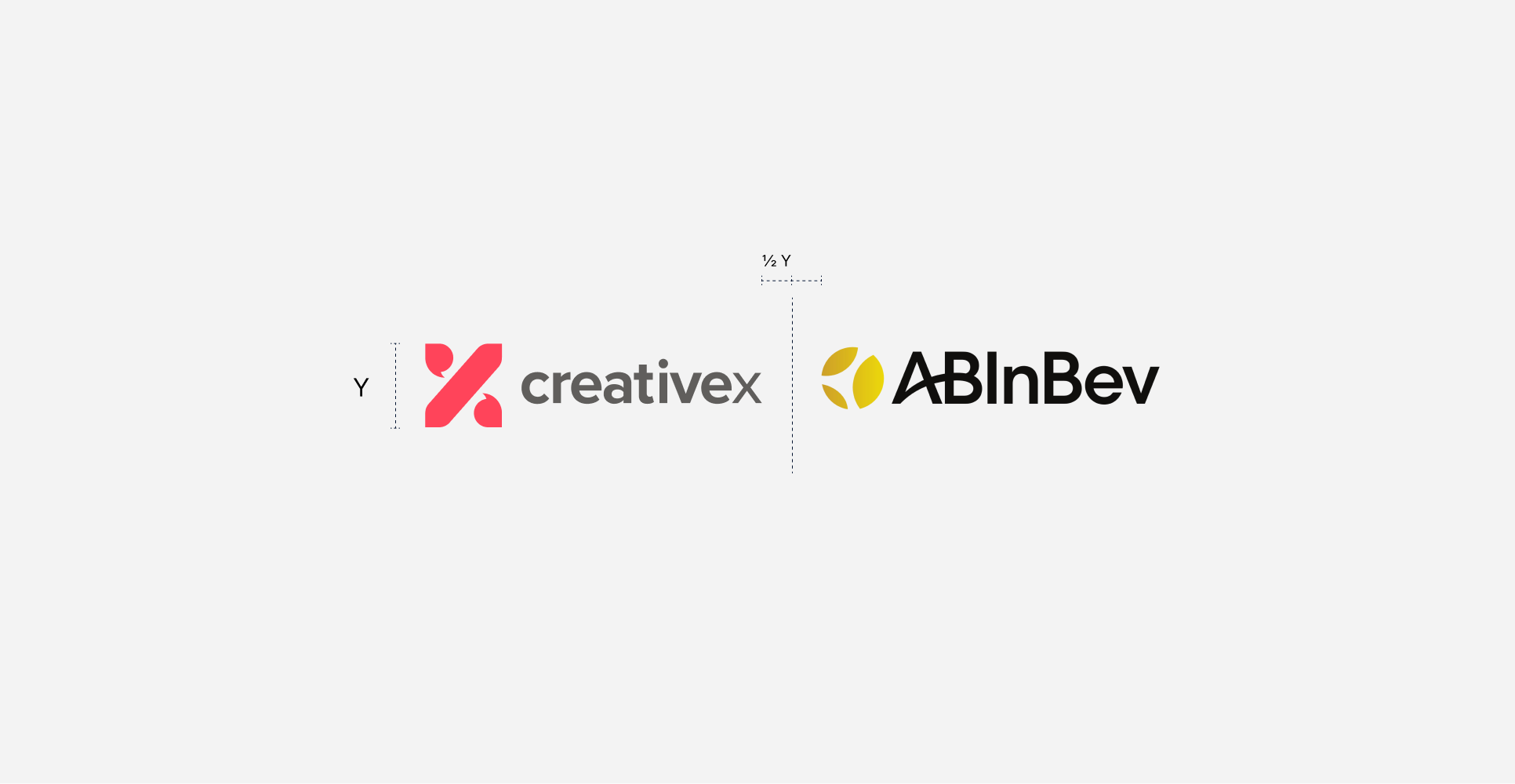
The logo and the icon’s whitespace is equal to half the height of the icon as shown.
Our icon is a shorter version of our logo. Use the icon on its own only if you do not have enough room for the full logo or in cases when the CreativeX brand has already been established. While the icon can exist without the wordmark, the wordmark should never exist without the icon.
Primary Lockup
Clearspace
CreativeX Icon

Clearspace

Incorrect Usage
Do not use the logo in ways that might change or alter its consistency with the rest of the brand. If there is ever any doubt, only use the logo files provided.


Do not distort the logo type or crop the logo
Do not resize any elements
Do not house the logotype in a shape
Do not keyline the logotype
Do not alter the font
Do not house any imagery within the logotype

Don’t use any non-branded colors for the logotype

Don’t place the logotype on a low contrast background
Do not add any elements
Do not remove any elements
Do not enroach on the logo clearspace
Do not rotate the logo
Partnerships
Our logo maintains our clearspace and the partnership logo inherits our clearspace too. Partner logos should never exceed the height of the CreativeX logo.
Logo + Color
Taupe + Logo
B100 + Logo
Denim
Denim + Logo
06 Art Direction
Brand Shapes
Download Assets
Our brand shapes are abstract and flexible elements to support storytelling without overshadowing the narrative. Their simplicity allows them to flex across contexts and adapt to a variety of messages. You’ll find suggested themes accompanying each shape to help inspire their use, but there are no fixed rules around these interpretations. You can find the full library here.

Layered processes, Foundations, Building in stages, Structure, Stability, Vertical Progression, Scalability

Alignment, Collaboration, Intersection, Shared vision, Integration, Focus

Complexity, Interconnected systems, Global networks, Interplaying ideas, Evolution, Ecosystem
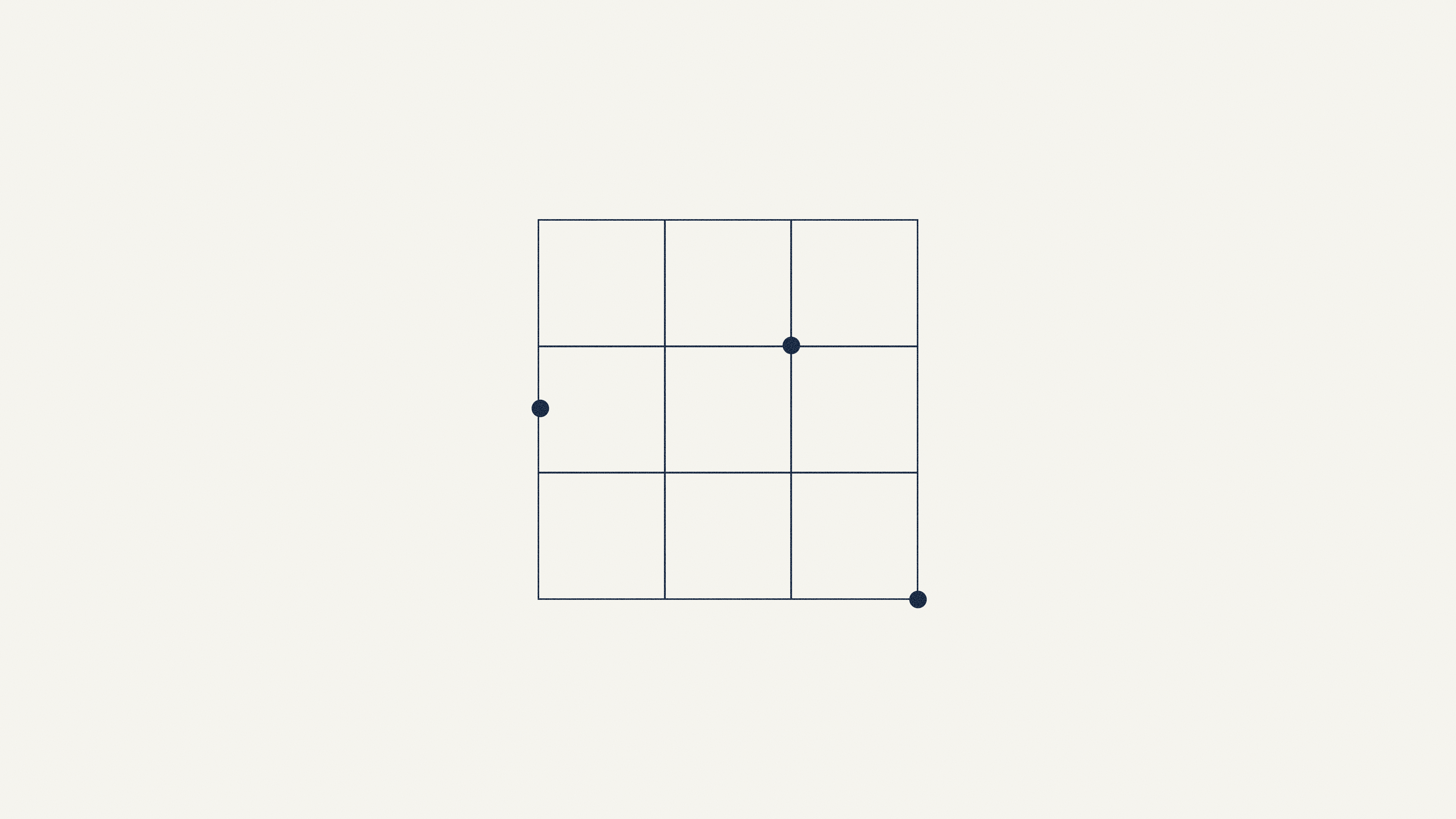
Structure, Organization, Framework, Systems, Alignment, Precision, Mapping or plotting, Strategic placement, Coordination
Photography
Photography brings our work into context. We use imagery to show how our product, insights, and ideas connect to the industries we support.
Our image library is organized by vertical, giving teams a quick way to find visuals that feel purposeful and relevant to support each story.

Industry-specific
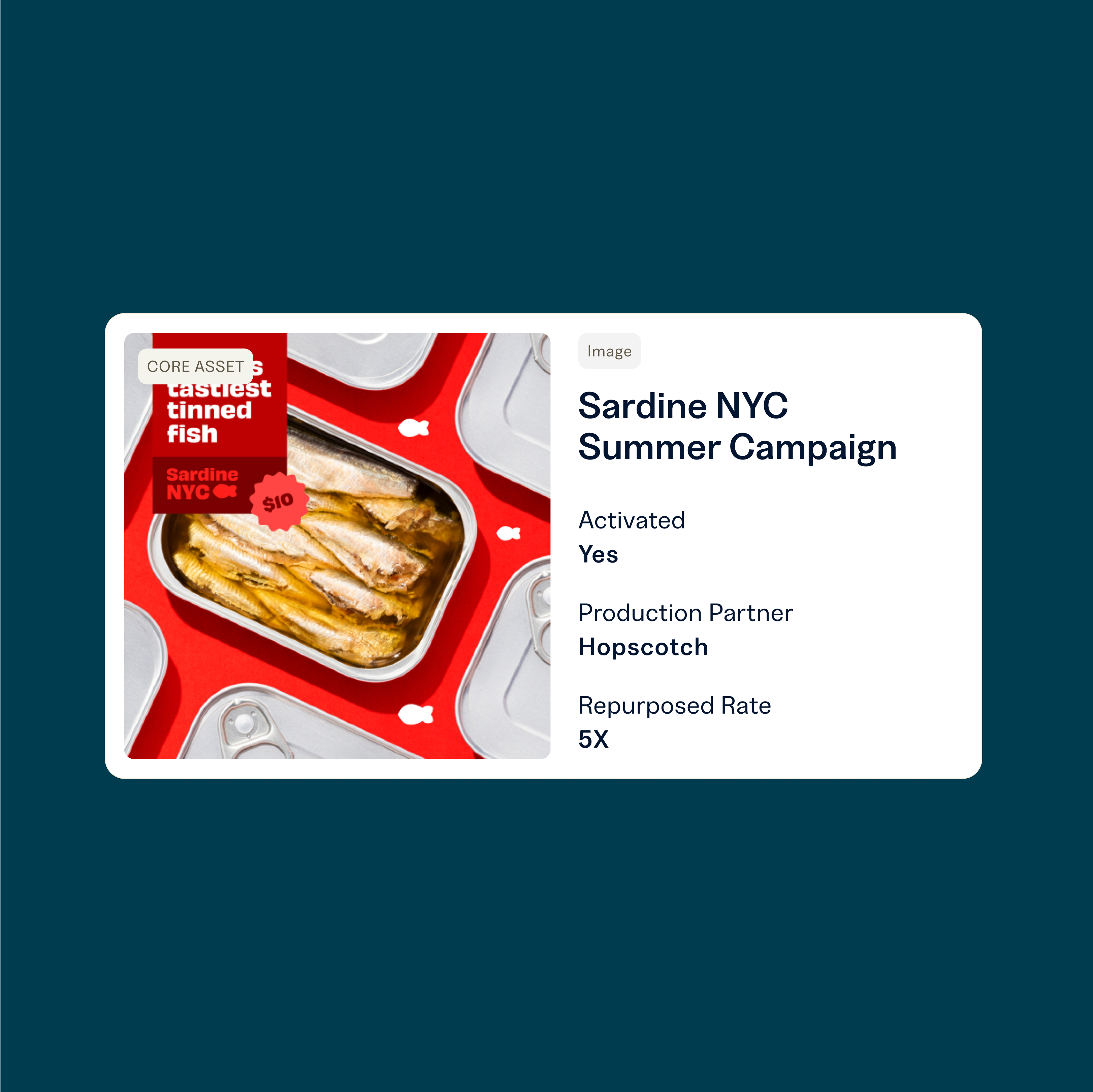
We create a personalized experience by using industry specific photography when speaking to our target accounts.

Relatable
We use photography to help our customers see themselves in the brand.

Emphasis on Craftsmanship
Hands-on imagery (like sketching or assembling components) creates a tangible narrative. It shows that we value the journey of creation and quality iteration, not just the final outcome.

Subtle Technology Integration
Photography should include elements of technology—people interacting with computers, working with data, and drawing insights.
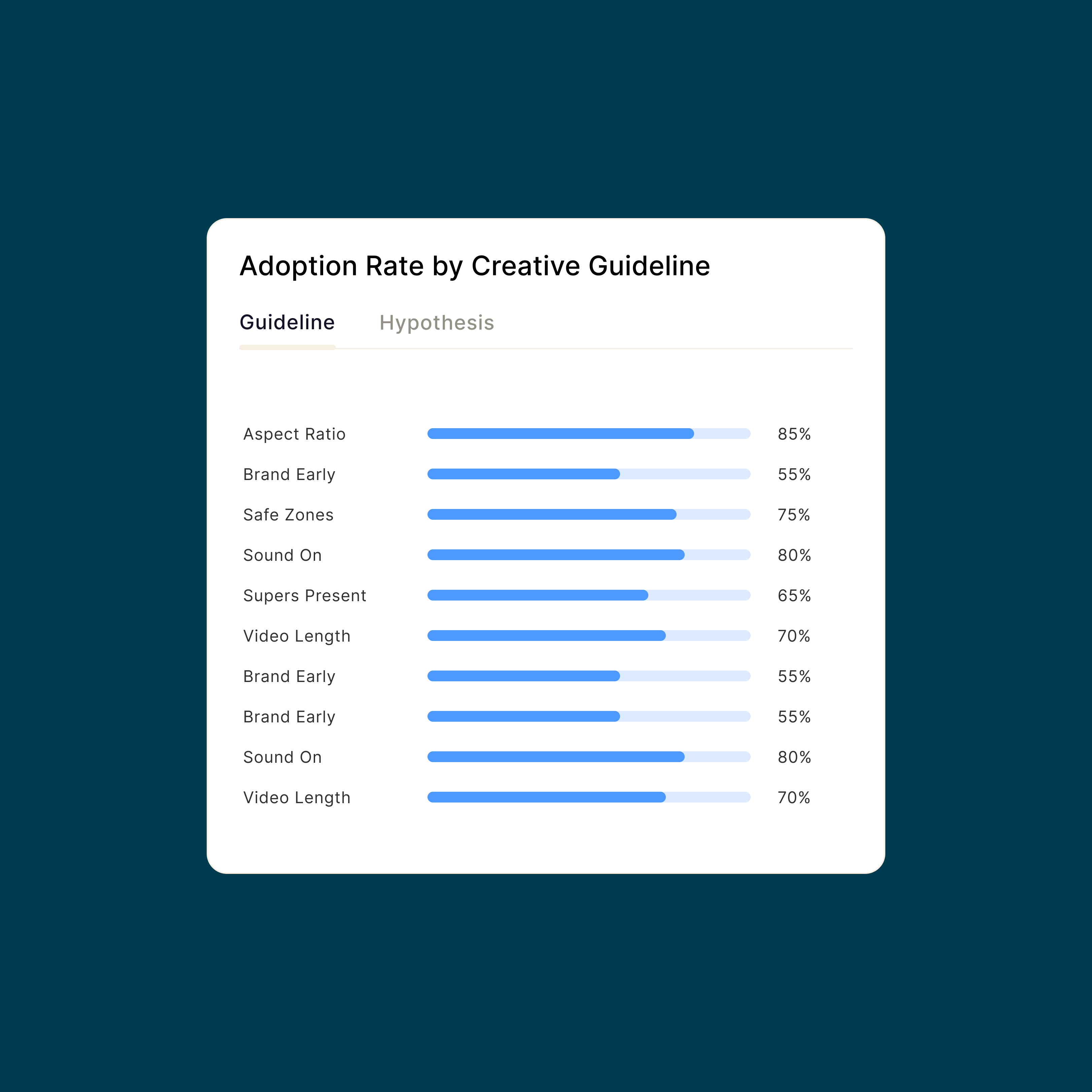
Product Imagery
We focus on specific features and components to guide the user's eye to the most important elements of the product. This helps us simplify the story and allows the visitor to instantly grasp the one main feature or benefit being discussed in the adjacent text.